Consistency builds trust—and in commercial real estate, trust accelerates leases. A brand style guide keeps every touchpoint aligned as your property portfolio grows. Whether you operate five communities or fifty, here's how to build a guide that works.
A brand style guide is one of the most valuable documents a commercial real estate firm or property development can have. It is the single source of truth that keeps every marketing touchpoint, every vendor deliverable, and every piece of signage aligned with your brand. Without it, inconsistency creeps in fast, and inconsistency erodes trust.
Here is how to build one that actually gets used.
1. Define your visual identity
Start with the elements your team will reference most often: logo usage rules, brand colors, and typography. For each, give people enough detail to apply it correctly without calling you.
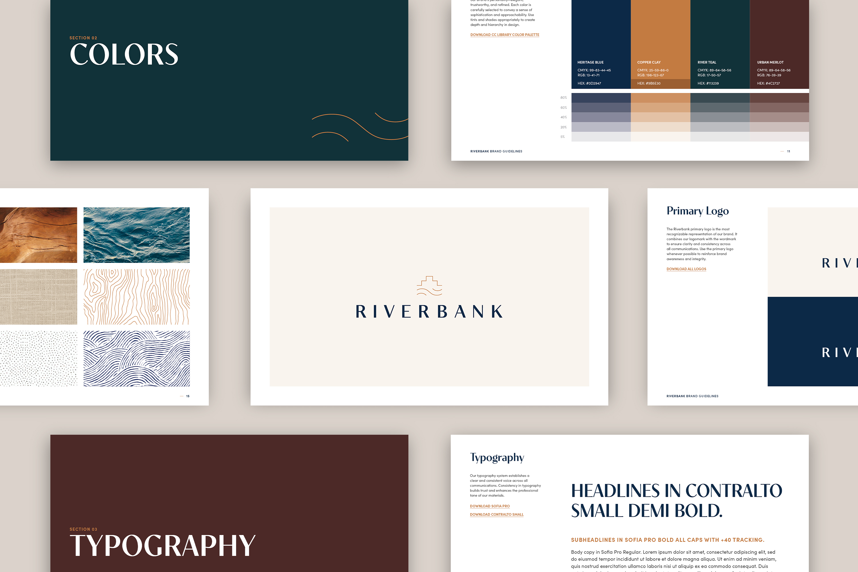
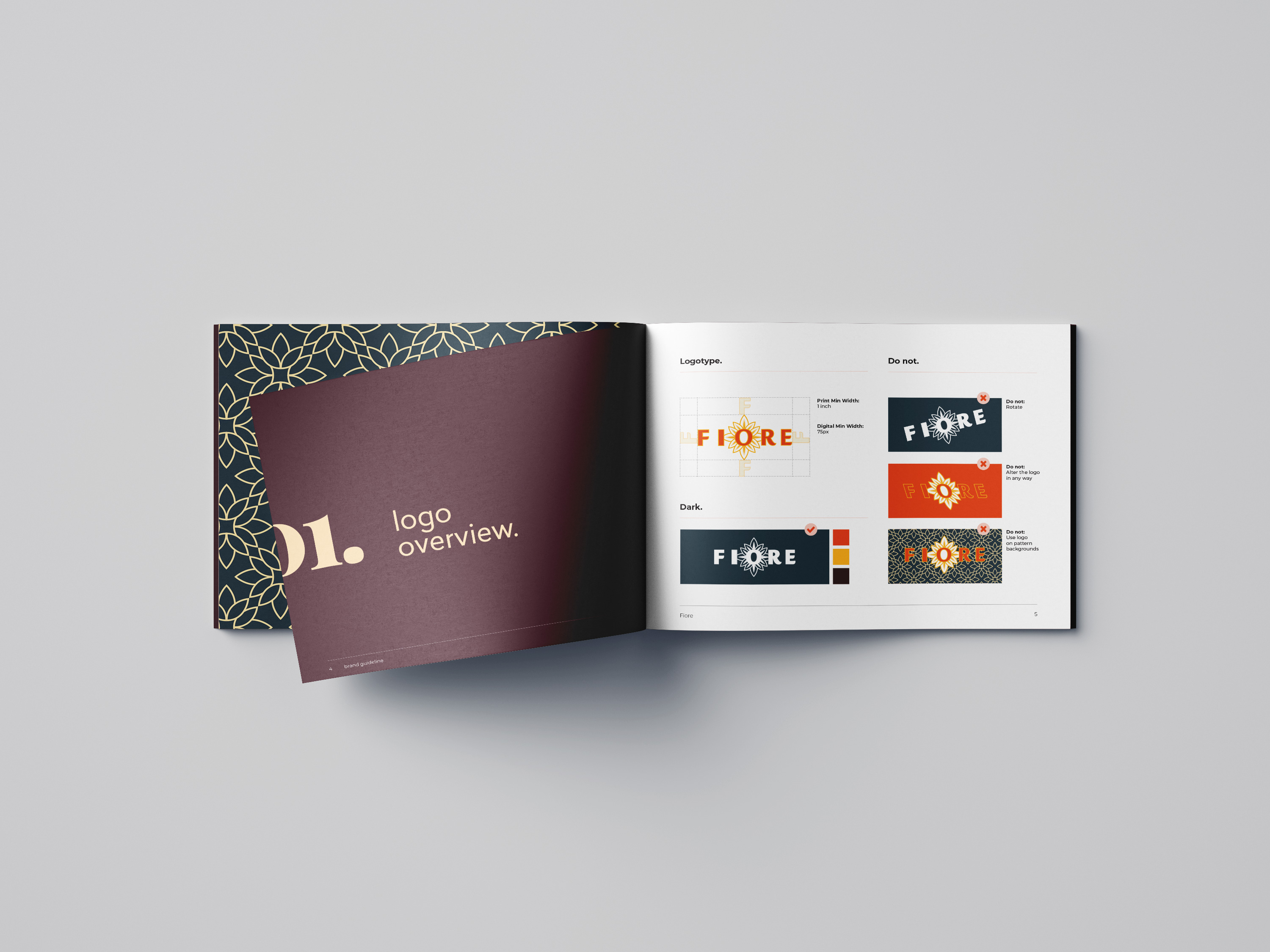
Logo rules. Show the approved versions of your logo and the scenarios where each applies. Include clear and dark backgrounds, horizontal and stacked lockups, and minimum size requirements. Show what not to do just as clearly as what to do. Unauthorized color swaps, stretched proportions, and drop shadows all belong in a never-do-this section.
Color palette. Specify every brand color with its hex, RGB, and CMYK values. Primary colors should dominate. Secondary and accent colors support them. Show color ratios in application so designers understand hierarchy, not just options.
Typography. List primary and secondary typefaces, where each is used, size scales, and line spacing. Include licensed font information or alternatives for situations where premium fonts are not available.
2. Set the tone with brand voice
Visual identity tells people what your brand looks like. Brand voice tells them what it sounds like. For CRE firms and multifamily developments, this is often the element most missing from internal guides.
Define your tone with two or three clear descriptors: confident and grounded, sophisticated and accessible, or direct and warm. Then illustrate each with real examples: how you would describe your property in a leasing brochure versus a social caption versus an investor email. Show the difference between on-brand language and off-brand language so the gap is impossible to miss.
Include your key messaging pillars, your positioning statement, and any approved taglines. If your brand has words it never uses, list those too.
3. Image and photography guidelines
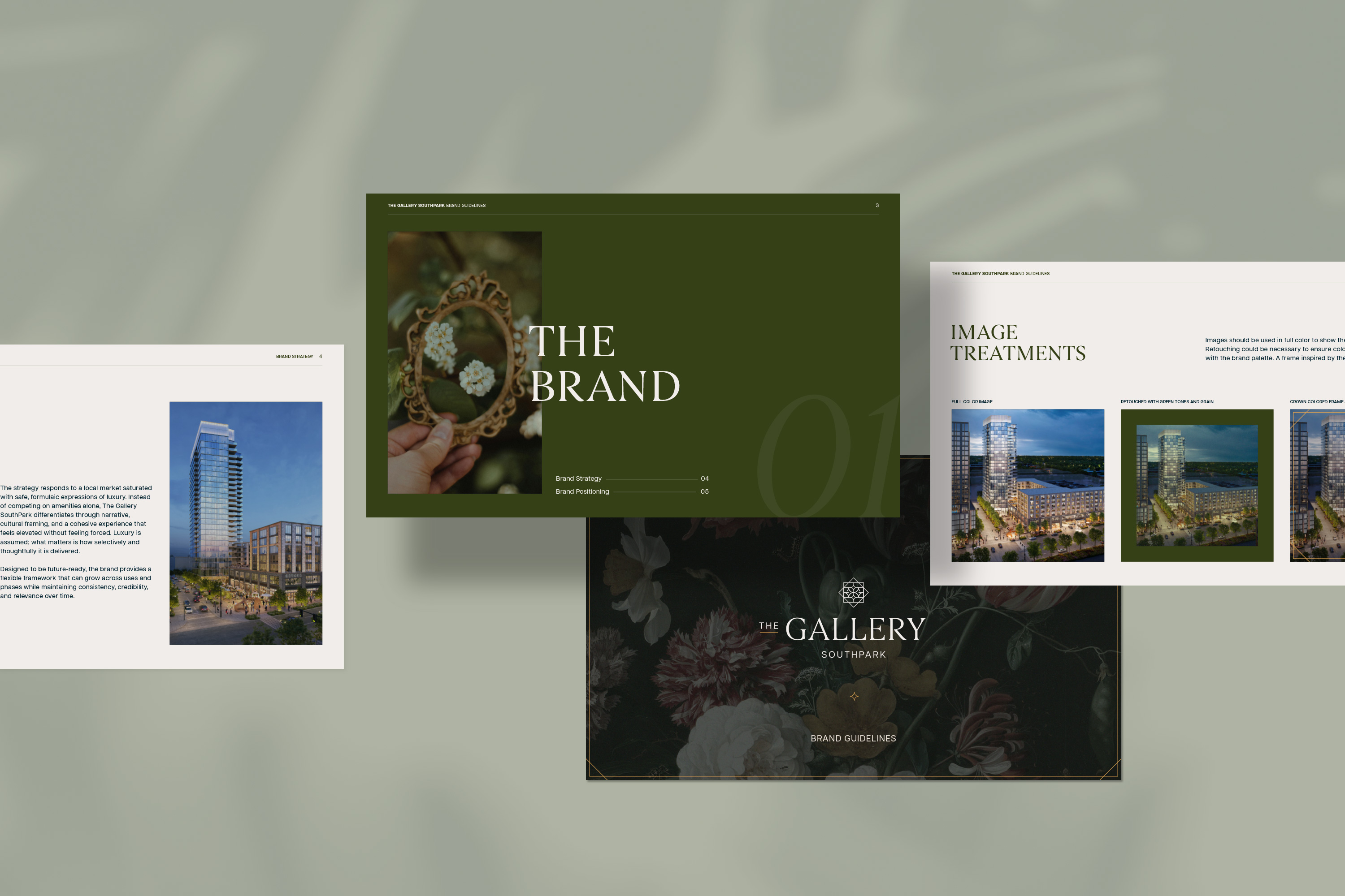
In commercial real estate, photography does more work than almost any other brand element. Your style guide needs to give vendors and internal teams a clear picture of what good looks like.
Describe your preferred visual style: natural light versus dramatic contrast, lifestyle-forward versus architecture-forward, color-graded or true-to-tone. Include mood references and examples of approved imagery alongside examples of what to avoid. Address retouching standards, required shot types for each property, and how you handle photography for different uses: leasing, digital, print, and social.
4. Signage, print, and environmental usage
For property developments, physical brand presence is critical. Your style guide should address how the brand shows up in built environments: monument signage, construction fence wraps, lobby materials, leasing office displays, and directional signage.
Include templates where possible. Show how logo placement, color application, and typography translate from screen to physical material. Specify any print production notes, such as minimum dot gain adjustments or preferred substrates, that affect how the brand renders off a screen.
5. Digital guidelines
Digital is where most day-to-day brand application happens, and where inconsistency shows up most quickly. Your guide should cover web design patterns, social media templates, and email standards.
For web, specify button styles, link colors, header hierarchy, and image ratios used on your site. For social, include cover photo dimensions, post template ratios, and how the logo is positioned on branded graphics. For email, include header layout, font stack fallbacks for non-brand-font environments, and standard footer requirements.
If your team uses a platform like Canva, Figma, or Adobe Express for day-to-day creative, link to approved template files within the guide so people can find them immediately.
Keep it living
A brand style guide is not a document you create once and file away. It should be updated when your brand evolves, when new applications are added, or when common misuse patterns reveal gaps in the existing guidance.
The best guides are specific enough to prevent bad decisions and flexible enough to support good ones. If someone on your team or a vendor you just hired can open it and know exactly how to use your brand within ten minutes, it is doing its job.
If you do not have a brand style guide, or the one you have is not being used, that is worth paying attention to. Talk to us about what a complete brand system looks like for a CRE firm at your stage.